这篇文章受到 Anisa Dhana 的博文 ‘Map Visualization of COVID-19 Across
the World with R’ 启发,尝试使用 R 语言绘制新冠肺炎 COVID-19 在国内的确诊、治愈和死亡地图。
数据准备
COVID-19 Data
绘制地图的第一步是收集数据。
首先,我们感谢约翰霍普金斯 CSSE Johns Hopkins CSSE, 他们将全球的疫情数据按照日期制作成了单一的 CSV 文件方便进行各类分析和统计。我们可以从 Github 页面获得需要的数据。
P.S. 非常建议大家直接使用 read_csv 从源 URL 直接获取数据,这样便于日后维护更新。但是因为个人原因,案例中使用下载至本地的 csv 作为数据源。此操作不影响后续的任务。
library(tidyverse)

# Read the daily CSV file from Jons Hopkins CSSE I highly recommand to read_csv
# from url directly. But for my personal reason I have to download csv and read
# it from local path.

# df_origin <-
# read_csv('http://raw.githubusercontent.com/CSSEGISandData/COVID-19/master/csse_covid_19_data/csse_covid_19_daily_reports/03-07-2020.csv')
df_origin <- read_csv("03-07-2020.csv")

# Replace the slash into underline to make it easyily to filter
names(df_origin) <- names(df_origin) %>% str_replace_all("/", "_")

# Keep the data of mainland and three regions of China
df_cov_china <- filter(df_origin, Country_Region %in% c("Mainland China", "Taiwan",
    "Hong Kong", "Macao"))

head(df_cov_china)

## # A tibble: 6 x 8
##   Province_State Country_Region `Last Update`       Confirmed Deaths Recovered
##   <chr>          <chr>          <dttm>                  <dbl>  <dbl>     <dbl>
## 1 Hubei          Mainland China 2020-03-07 11:13:04     67666   2959     43500
## 2 Guangdong      Mainland China 2020-03-07 10:43:02      1352      7      1237
## 3 Henan          Mainland China 2020-03-07 11:23:10      1272     22      1244
## 4 Zhejiang       Mainland China 2020-03-07 09:03:05      1215      1      1154
## 5 Hunan          Mainland China 2020-03-07 09:03:05      1018      4       960
## 6 Anhui          Mainland China 2020-03-06 03:23:06       990      6       979
## # ... with 2 more variables: Latitude <dbl>, Longitude <dbl>
Map Data
我们采用了包含两岸三地、藏南、阿克赛钦以及南海九段线的完整中华人民共和国的行政区划地图。这些数据将会托管在 Github 上进行分享,大家可以按需取用。
library(rgdal)

# Read China Admistrative Area data from Shapefile.  To avoid the compatibility
# issue across systems, including Unix-like system and Windows. I highly
# recommand to use the file.path function to create the file paths.
map_cn_area <- file.path("mapData", "China_adm_area.shp") %>% readOGR()

## OGR data source with driver: ESRI Shapefile
## Source: "C:\Users\chenh\OneDrive\Develop Learn\R\Map Visualization of COVID-19 Across China with R\mapData\China_adm_area.shp", layer: "China_adm_area"
## with 34 features
## It has 10 fields

# Conver the SpatialPolygonsDataFrame to DataFrame which can be held by ggplot2
df_cn_area <- fortify(map_cn_area)

# Read the names of Province or region, and convert the name from PinYin to
# English.  This can match the Province name between WHO data and map data.
ls_province_name <- map_cn_area@data$ID %>% str_replace("Xianggang", "Hong Kong") %>%
    str_replace("Aomen", "Macao")

# The id is the unique serial to recongize the different province from map data.
ls_id <- unique(df_cn_area$id)

# The orders of id and province name is all the same, the bind operation will
# combine the province name and id in different data.frame Use Proveince_State to
# Join data from WHO data and map data
df_final <- df_cn_area %>% left_join(bind_cols(Province_State = ls_province_name,
    id = ls_id)) %>% left_join(df_cov_china, by = "Province_State")

# Read the boundary of provinces and regions from shapefile, it will be a
# SpatialLinesDataFrame
map_cn_bord <- file.path("mapData", "China_adm_bord.shp") %>% readOGR()

## OGR data source with driver: ESRI Shapefile
## Source: "C:\Users\chenh\OneDrive\Develop Learn\R\Map Visualization of COVID-19 Across China with R\mapData\China_adm_bord.shp", layer: "China_adm_bord"
## with 1785 features
## It has 8 fields
## Integer64 fields read as strings:  FNODE_ TNODE_ LPOLY_ RPOLY_ BOU2_4M_ BOU2_4M_ID

df_cn_bord <- fortify(map_cn_bord)
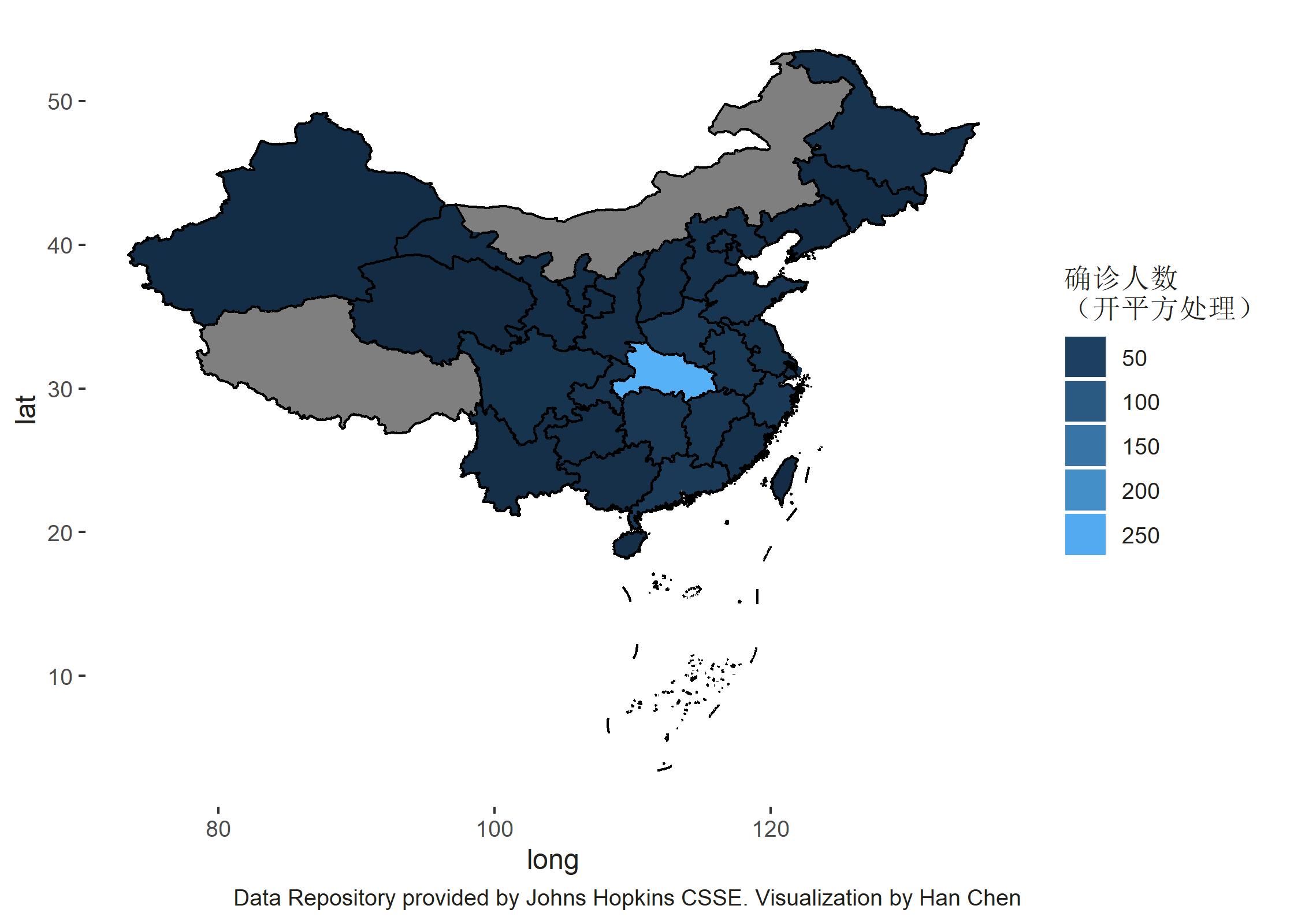
数据可视化
当所有的数据准备完成,便可以使用 ggplot2 进行可视化操作。使用 geom_polygon 来绘制不同行政区,因为数据类型是 SpatialPolygonsDataFrame 而使用 geom_path 来绘制行政区的边界,因为数据类型是SpatialLinesDataFrame。
我们需要额外考虑的问题是,因为武汉的患者数量数倍于国内其他区域范围内的患者数量,故此为了能够较为有层次的显示病患数量,我们将数据进行平方根开方处理。
library(ggplot2)
# The group is unique serial of each province and region, in this case, it is
# similar with id.  Use geom_polygon to plot the area part, and use geom_path to
# plot the boundary part.  To make the data can be comparable, the patients in
# Hubei Province are multiple times than those in other provinces and regions,
# the data is root-square transformed.
ggplot() + geom_polygon(aes(x = long, y = lat, group = group, fill = sqrt(Confirmed)),
    data = df_final) + geom_path(aes(x = long, y = lat, group = group), color = "black",
    data = df_cn_bord) + labs(caption = "Data Repository provided by Johns Hopkins CSSE. Visualization by Han Chen") +
    guides(fill = guide_legend(title = "确诊人数\n(开平方处理)")) + theme(text = element_text(color = "#22211d"),
    plot.background = element_rect(fill = "#ffffff", color = NA), panel.background = element_rect(fill = "#ffffff",
        color = NA), legend.background = element_rect(fill = "#ffffff", color = NA))